
Columns are sorted in opposite order for Light and Dark themes

Description
AppResponse Web UI sorts columns in opposite order for Light and Dark themes.

Issue
Appliance seem to sort the data incorrectly in Web UI. However, it's just sorting it in the opposite order for Light and Dark themes.
.png)
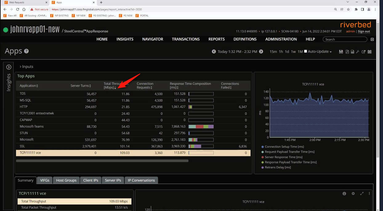
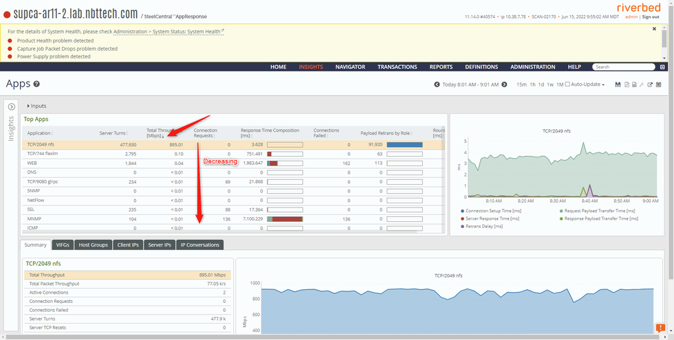
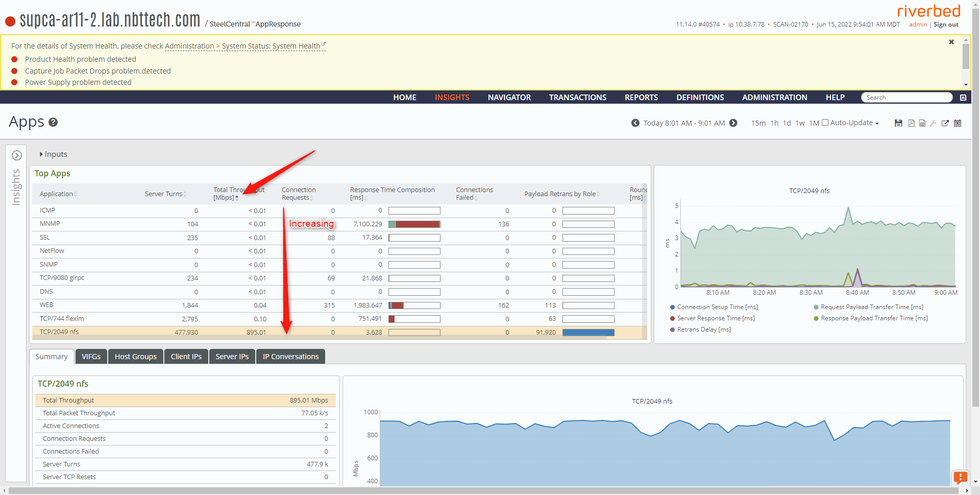
Notice the "Total Throughput" column in the above screenshot. The data is sorted/displayed in the reverse order of what has been selected up at the top.
Same thing happened for all other insights as well.
After checking in the Lab, when we select the up arrow, it's in ascending order and vice-versa. Whereas in the customer's case, it's the other way round.

Solution
A BUG has been opened and this is being investigated by Engineering currently.

Related Bugs

Attachments

Related Files
NOTICE: Riverbed® product names have changed. Please refer to the Product List for a complete list of product names.
Can't find an answer? Create a case